The brief
Funding Traders needed their marketing site to match the seriousness of the capital they manage. With 53,000+ funded accounts and verified payouts behind them, the product had earned its credibility — but the existing layout looked dated next to newer prop trading competitors, and that gap was costing trust before a visitor ever reached the sign-up form.
Process
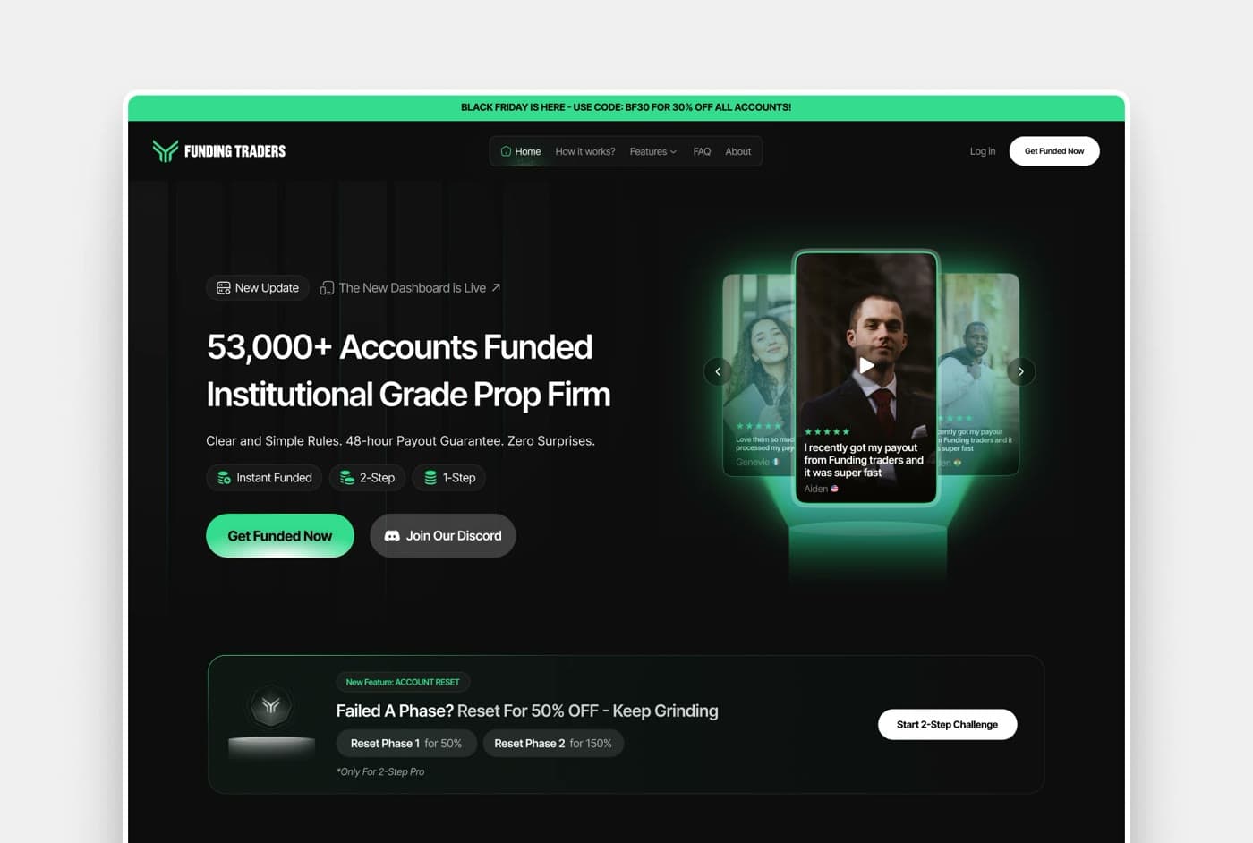
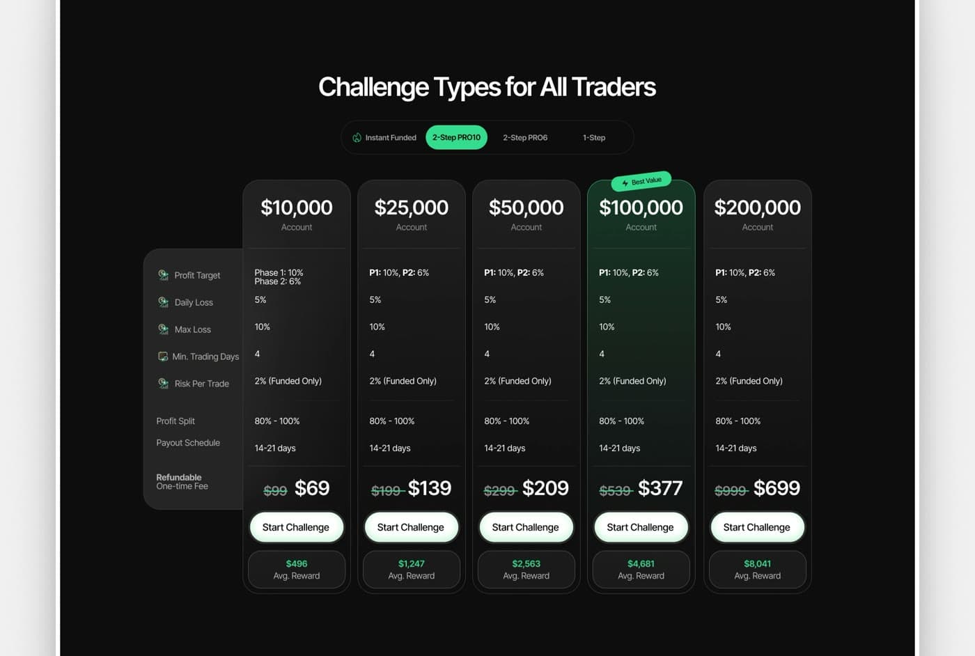
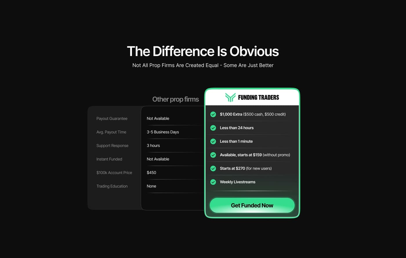
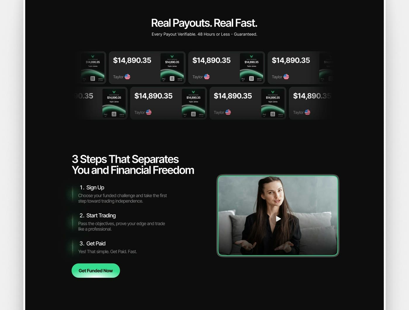
I started with a section-by-section visual audit, sorting what was doing conversion work from what was just noise: weak type hierarchy burying trust signals, low-contrast CTAs, social proof that wasn't landing. From there I set a direction — a dark base with the brand green pulled back to accent-only use, closer to a premium trading platform than a typical prop firm template — then redesigned each major section (hero, payout ticker, challenge pricing, social proof, platform logos, FAQs) and assembled them into a full-page composition in Figma.
What changed
A clearer value proposition above the fold, a tighter type scale that gives payout amounts and account counts the dominant sizing, payout certificates and testimonials rebuilt as consistent scannable cards, and a challenge pricing table with clear grouping, readable rule breakdowns, and a prominent CTA per tier.
Outcome
A visual system the team could extend themselves — new pages, new promos, new challenge tiers — without breaking the trust the redesign was built to create, with a clearer path from hero to CTA and a dark-mode-first language the brand can carry forward.