The brief
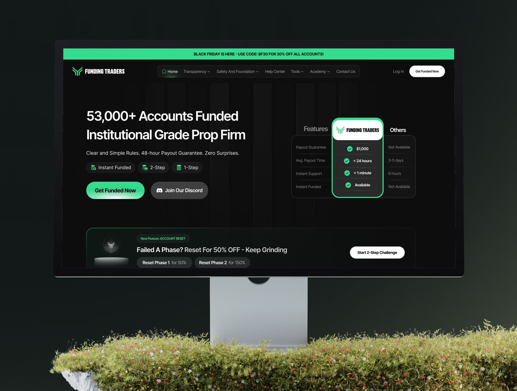
Funding Traders needed their marketing site to match the seriousness of the capital they manage. The existing layout worked, but it looked dated next to newer prop trading competitors — and that gap was costing them trust before a visitor ever got to the sign-up form.
What changed
The redesign focused on three things: a clearer value proposition above the fold, a visual language that reads as "institutional" rather than "template," and a funnel that gets serious traders to the challenge sign-up faster.
Outcome
A visual system the team could extend themselves — new pages, new promos, new challenge tiers — without breaking the trust the redesign was built to create.